TUTTI I MOTORI FERRARI
ALL FERRARI ENGINES
Author: Gianni Rogliatti
2002 / text I.E. / pp. 140 / ill. c. 73, b&w 190 / soft cover book, 247x199mm
(the front cover has been patterned the way the surface of an engine cast looks;
black and white images seen in the book are partly colorized red)
Nava Milano spa 1807/02
Beginning with the type 125s up to the Ferrari Enzo all engines ever built at Ferrari become
elucidated here. Illustrated with respective pictures and sectional drawings and small images
of the originals they have been fitted to. The convenient volume was released to continue and
to complement a document from 1985, entitled Technical specifications of Ferrari engines built from
1946 to 1985. On the pages 130 to 139 specification data of all machines are shown, partitioned
in 14 columns. An accurate nice guide to the expert of the marque and for those who want to
become one.
Ferrari F1: Synonomous with Speed

There’s nothing in the world like a really fast car, and the MoMA design collection has one of the world’s fastest: the 1990 Scuderia Ferrari Formula 1 High Performance Racing Car (641/2), by British auto designer John Barnard.
Though not a recent acquisition, I thought it fitting to feature the Ferrari now in honor of Fernando Alonso and Ferrari’s first podium of the 2014 Formula 1 season at the recent Chinese Grand Prix.
As designer John Barnard explains in an audio guide segment from the 2002 exhibition AUTObodies: speed, sport, transport, the 641, or F1-90, as it’s become known, was built for speed. And it delivered. Plus it’s red. Fiery red. Ferrari red, in fact. Red means danger, look out, hot stuff coming through; it’s the color of anger, passion, and seduction, and as everyone knows, red cars go faster.

Scuderia Ferrari has been part of Formula 1 since the beginning, so it’s no wonder that the racing team holds so many F1 records, including the most constructor and driver championships and most overall wins. Each Formula 1 team races two cars; in 1990 two world championship drivers, Alain Prost and Nigel Mansell, drove the 641 for Ferrari, combining for three pole positions, five fastest laps, and six wins. As reigning champion,Prost’s was the number one car; and he came close to repeating—only to lose out to another world champion,his arch rival Aryton Senna.
The formula, or the overall guiding regulations of Formula 1, has changed over the years with countless modifications and improvements. And big changes came this year with the hybrid 1.6-litre V-6 turbo engine with ERS (Energy Recovery Systems), a major shift from the 2013 2.4-litre V-8. Overall design changes accompanied the new, greener 2014 engines, but likely the most notable and most talked about change is the new engine sound—or lack of it. Drivers have said they can hear the wind over the engine noise; used to be all you could hear was the engine.
The sound of the 1990 641 Ferrari 3.5-litre V-12 engine is familiar to race fans the world over. Like none other, it screams exhilaration, excitement, and pure power.
The world of Grand Prix motor racing is one of precision, with its rigorous formula, and exacting calculations; it’s a culture unto itself with a complicated set of rules and statistical systems of points and penalties spoken in a language of strange numbers and acronyms. But it’s the visceral experience of raw power, crazy kinetic energy, and speed of the cars that ignites our imagination—the remarkable talents and mad skills of drivers the draws us in.

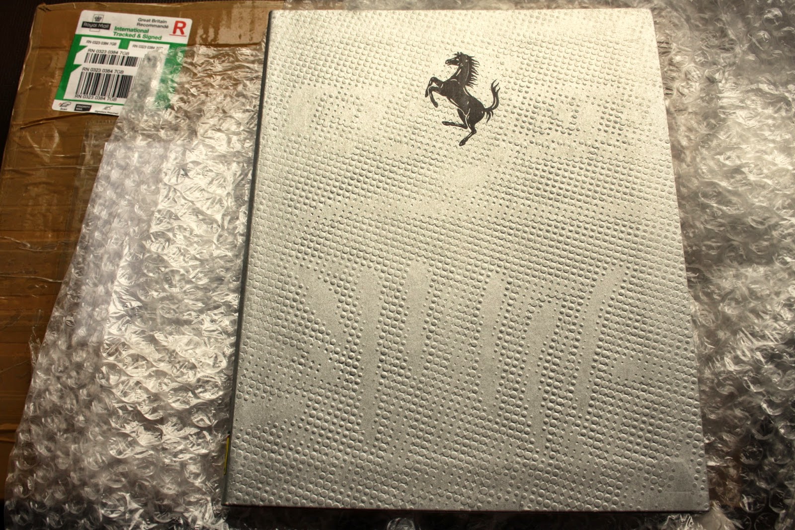
“Tutti i Motori Ferrari,” a catalogue of Ferrari engines designed by the Dutch graphic artist Irma Boom is also in MoMA’s design collection. Its soft, outer cover displays the Ferrari prancing horse logo on a silver-colored background that looks to be made of a fluid version of same the aluminum alloy used for F1 engine blocks; the interior plates showcase the evolution of the engines throughout Ferrari’s history. (A flip through of the pages of “Tutti I Motori Ferrari” begins at the one minute mark in the video “20 books by Irma Boom.”)
Before AUTObodies MoMA’s Ferrari 641-2 was first on view in the 1993 exhibition Designed for Speed: Three Automobiles by Ferrari. It can presently be found hanging on the wall in MoMA’s Lewis B. and Dorothy Cullman Education and Research Building lobby, like a perfect portrait of a high-performance machine.
PB: We spoke 10 years ago when we did an interview for Abitare magazine. What has changed since then?
IB: I’ve moved from the office on Kerkstraat to this one on Koninginneweg which is much bigger. The old studio was such a mess. Everybody loved the total chaos, but I always felt ashamed because I knew that in all the eight or nine years I was there I vacuumed only twice. It was really dirty. Here, I’m surrounded with birdsong from the backyard and the smell of honeysuckle from the small front garden. In the end, I must say that having a bit more organised office is much better for the mind. Cleaning the house is cleaning the mind.
IB: I’ve moved from the office on Kerkstraat to this one on Koninginneweg which is much bigger. The old studio was such a mess. Everybody loved the total chaos, but I always felt ashamed because I knew that in all the eight or nine years I was there I vacuumed only twice. It was really dirty. Here, I’m surrounded with birdsong from the backyard and the smell of honeysuckle from the small front garden. In the end, I must say that having a bit more organised office is much better for the mind. Cleaning the house is cleaning the mind.

Irma Boom Office, Amsterdam
Has your work changed in any way?
A big change was that one of my main commissioners* Paul van Vlissingen died of cancer. I worked with him for sixteen years. A lot of my time was spent working together with him on his books. So when he died, it was first of all very sad. I lost a commissioner, a friend, a collaborator with whom I’d spent so much time. The first commissioner who gave me complete trust and freedom. He gave me so many opportunities to make unusual books like the SHV Think Book. I think I spent half of my time working with him. One or two books a year, plus many other things I designed for African Parks. If you’ve dedicated so much time to one commissioner you can imagine when this collaboration was gone, suddenly I had so much time.
Right. The end of one thing is often a beginning of something else.
Yes, exactly. That’s actually a statement from the SHV book I worked on with Van Vlissingen. The end of one thing is the beginning of something new. It is true. I’ve already had a few collaborations with some artists and architects. Recently Project Japan was released, a book by Rem Koolhaas and Hans Ulrich Obrist. A project on which we’ve worked constantly for one and a half years. Before there wouldn’t have been space to do intensive projects like this.
Yes, exactly. That’s actually a statement from the SHV book I worked on with Van Vlissingen. The end of one thing is the beginning of something new. It is true. I’ve already had a few collaborations with some artists and architects. Recently Project Japan was released, a book by Rem Koolhaas and Hans Ulrich Obrist. A project on which we’ve worked constantly for one and a half years. Before there wouldn’t have been space to do intensive projects like this.
Do general trends such as the transition from print to digital affect you?
I am very happy with the Internet, e-readers and all the new technologies. Many conventional books can go digital now. Often when I go to a bookstore I get really depressed by all the books that could have been PDFs. On the other hand, my books are three-dimensional objects and very hard to replace with electronic books. If people come to me, they come for something special or better: they expect something new. I think the Internet and e-readers make what I am doing much more clear. The definition is more precise, and my position is a lot more defined.
I am very happy with the Internet, e-readers and all the new technologies. Many conventional books can go digital now. Often when I go to a bookstore I get really depressed by all the books that could have been PDFs. On the other hand, my books are three-dimensional objects and very hard to replace with electronic books. If people come to me, they come for something special or better: they expect something new. I think the Internet and e-readers make what I am doing much more clear. The definition is more precise, and my position is a lot more defined.
Does that mean that you would not create an electronic book?
No. I just did an annual report for a new commissioner. It is a tiny annual report, but if you see the PDF, it actually gives a new dimension and looks actually very good on a screen. The Sheila Hicks book as a PDF would be nothing. That’s the type of book where the weight and the scale and the paper are very important, but for some books it is less so. I think the idea of a book as an object has become more important.
No. I just did an annual report for a new commissioner. It is a tiny annual report, but if you see the PDF, it actually gives a new dimension and looks actually very good on a screen. The Sheila Hicks book as a PDF would be nothing. That’s the type of book where the weight and the scale and the paper are very important, but for some books it is less so. I think the idea of a book as an object has become more important.
PB: You are obviously known as a book designer, but you do other projects as well?
Yes, but book design is the thing I love. I’m also interested in other things such as monumental commissions in public spaces as well as interior spaces. We are now working on a 110 meter long tunnel near the Amsterdam Central station.
Yes, but book design is the thing I love. I’m also interested in other things such as monumental commissions in public spaces as well as interior spaces. We are now working on a 110 meter long tunnel near the Amsterdam Central station.
When people ask me for a thin book, they often end up with a thick book. They want to have a 148 page book and it ended up being 864 pages, it happens. And the tunnel, they asked me for a 30 cm strip in the tunnel but now we are doing the whole length of the tunnel. We’ve worked on it for a few years now and it is being executed right now.
How do you find more space in projects than there really is?
The Design Museum in Zurich has such an enormous collection, they have millions of objects. They wanted a book of 148 pages and seventy images. They showed me the images, and I couldn’t imagine using them. So I went to their archive myself, and I got access to their intranet site. I spent a lot of time looking for specific and non-specific images, important and non-important. I wanted to manifest the quantity of this enormous archive as a fat book with many images. If you have so many pages there must be a urgency to turn these pages. In order to get this done I made very tempting image combinations and sequences. I came with a prototype, a very precise model of this book. If you want to convince a commissioner you have to be very precise and have good arguments. I brought an exact prototype of the book, which had the 864 pages, to the meeting organised in Zurich. When they saw it, everybody was very quiet. Then they called the museum director and he said “This will be THE book for our museum!” If you come with a convincing concept and arguments and a book which does what it should do. If they hadn’t accepted the idea I would not have compromised, I would have fought for the book as proposed. So from something tiny it becomes something really very big. And now it is a book which puts Design Museum Zurich on the map. This book is in every museum store in the world. So for them it became an important tool. And I think that is an interesting aspect of making books, that they become tools which work for everyone involved. If you talk about the last ten years of my work, I’ve tried to develop that idea better.
The Design Museum in Zurich has such an enormous collection, they have millions of objects. They wanted a book of 148 pages and seventy images. They showed me the images, and I couldn’t imagine using them. So I went to their archive myself, and I got access to their intranet site. I spent a lot of time looking for specific and non-specific images, important and non-important. I wanted to manifest the quantity of this enormous archive as a fat book with many images. If you have so many pages there must be a urgency to turn these pages. In order to get this done I made very tempting image combinations and sequences. I came with a prototype, a very precise model of this book. If you want to convince a commissioner you have to be very precise and have good arguments. I brought an exact prototype of the book, which had the 864 pages, to the meeting organised in Zurich. When they saw it, everybody was very quiet. Then they called the museum director and he said “This will be THE book for our museum!” If you come with a convincing concept and arguments and a book which does what it should do. If they hadn’t accepted the idea I would not have compromised, I would have fought for the book as proposed. So from something tiny it becomes something really very big. And now it is a book which puts Design Museum Zurich on the map. This book is in every museum store in the world. So for them it became an important tool. And I think that is an interesting aspect of making books, that they become tools which work for everyone involved. If you talk about the last ten years of my work, I’ve tried to develop that idea better.

Every Thing Design, The Collections of the Museum für Gestaltung Zürich, 2009
To get most out of the book medium?
Yes, that it works not just a pretty object that people can’t touch. A book that works as a tool. If a commissioner spends time on a book, then it better work for all of us.

Dummy spreads for the Every Thing Design book.
I had the idea that you mainly worked with small publishers, but looking at the books here on the table it appears you work also with the big publishers.
Does it surprise you? I did a few books with Phaidon and one with Taschen. It is interesting they gave me the trust and freedom to design the books I wanted. This is a big change in the appreciation of my work.
Isn’t Phaidon designing their books mainly in-house? So to commission you there must be a very good reason to make it look different.
It was in the case of the Misfit book. Hella Jongerius who said to Phaidon, “Irma has to design the book.”
It was in the case of the Misfit book. Hella Jongerius who said to Phaidon, “Irma has to design the book.”
The general trend in publishing is to divide what everyone is doing into departments, and your work blurs all these boundaries: you are involved with editing and designing books.
The kind of books I want to make require this involvement. And it is something I enjoy extremely. It is the ultimate collaboration between all parties on an equal level. Another thing is I have a problem with authority. I cannot handle it. I don’t accept mere orders how to do things, but I do listen to arguments. I am very ambitious to make a specific book, THE book for a specific subject. For example the Hicks book, I wanted to make a white book with a white cover instead of yet another image on the cover. In that sense it is intriguing and challenging. Marketing people hated it, but in the end the white book performed extremely well. My intentions were ambitious: I wanted to give Mrs. Hicks a new audience, not just the few people interested in textile. And this goal is achieved. The role of the designer is much more than make a book look good...
The kind of books I want to make require this involvement. And it is something I enjoy extremely. It is the ultimate collaboration between all parties on an equal level. Another thing is I have a problem with authority. I cannot handle it. I don’t accept mere orders how to do things, but I do listen to arguments. I am very ambitious to make a specific book, THE book for a specific subject. For example the Hicks book, I wanted to make a white book with a white cover instead of yet another image on the cover. In that sense it is intriguing and challenging. Marketing people hated it, but in the end the white book performed extremely well. My intentions were ambitious: I wanted to give Mrs. Hicks a new audience, not just the few people interested in textile. And this goal is achieved. The role of the designer is much more than make a book look good...
How do you deal with all the briefs and limitations that come with the projects, because of course there probably is a fixed budget and fixed deadline.
I am not interested in looking at the briefs, I prefer to have a meeting with the commissioner. Everybody is aiming for something exceptional, original, which is an impossible request. I am not trying to be original. I want to make specific books and if you have a good argument, it works.
I am not interested in looking at the briefs, I prefer to have a meeting with the commissioner. Everybody is aiming for something exceptional, original, which is an impossible request. I am not trying to be original. I want to make specific books and if you have a good argument, it works.
I suppose you still need to turn down some projects.
Yes, a lot. People get angry when you can not do a commission. It is a matter of interest and time, and time is of course precious and relative. I have time for people I want to spend time with. But even so, not every book is a success.
Yes, a lot. People get angry when you can not do a commission. It is a matter of interest and time, and time is of course precious and relative. I have time for people I want to spend time with. But even so, not every book is a success.
What do you mean? That collaboration doesn’t work, or the design, or the production?
I develop many books and that doesn’t mean all books are good. Of course I have the ambition to make the best, but circumstances are different. Sometimes it doesn’t work for different reasons even though you try very hard.
I develop many books and that doesn’t mean all books are good. Of course I have the ambition to make the best, but circumstances are different. Sometimes it doesn’t work for different reasons even though you try very hard.
And why do you think it happens?
It happens that I spend so much time on the interior of the book and I can not solve the cover. I have made a book for the artist John Wesley on which I spent so much time and it really turned out well, but I could not make the cover work at all. I was not able to come with a convincing proposal or argument to make it happen. The cover now does not represent the quality of the inside of the book at all. A missed opportunity, couldn’t avoid it, couldn’t get it done.
It happens that I spend so much time on the interior of the book and I can not solve the cover. I have made a book for the artist John Wesley on which I spent so much time and it really turned out well, but I could not make the cover work at all. I was not able to come with a convincing proposal or argument to make it happen. The cover now does not represent the quality of the inside of the book at all. A missed opportunity, couldn’t avoid it, couldn’t get it done.
Is the artist happy with the book?
Yes, he is totally happy. And it’s a good and interesting book, it is only the cover which doesn’t work. The cover is the last part of the design, but the first impression of a book.
Yes, he is totally happy. And it’s a good and interesting book, it is only the cover which doesn’t work. The cover is the last part of the design, but the first impression of a book.
Your work is quite innovative from many angles — in terms of production, but also in term of the working process. I suppose if you constantly do new things, inevitably there will be failures. Is this something that bothers you? Can you accept failure in your work?
I cannot accept that. But on the other hand you learn from mistakes. And I see a book not as a final result: it is an ongoing process and development. And when you work you have hits and misses.
I cannot accept that. But on the other hand you learn from mistakes. And I see a book not as a final result: it is an ongoing process and development. And when you work you have hits and misses.
Let’s have a look at this new Rem Koolhaas book: Project Japan: Metabolism Talks. Here the content is becoming the book, so you seem to make fewer design decisions. Is it easier to do a book like this?
What an observation! It is a very dense, layered book, almost a classic book, there is so much information. That’s something you hardly see nowadays, normally it is always spreads with images. It is of course a challenge to get a homogeneous book with so much different information. The book was designed during the process of developing the content. I don’t know how many prototypes we did, maybe 100 or 150, no idea, but many! All the time the book became more and more clear design-wise. So your remark about the content becoming the book is odd. We had to make so many design decisions, find a form for so many details. It’s the most exciting, intense and complex book I have designed for years. Every page is different and designed: 704 pages long.
What an observation! It is a very dense, layered book, almost a classic book, there is so much information. That’s something you hardly see nowadays, normally it is always spreads with images. It is of course a challenge to get a homogeneous book with so much different information. The book was designed during the process of developing the content. I don’t know how many prototypes we did, maybe 100 or 150, no idea, but many! All the time the book became more and more clear design-wise. So your remark about the content becoming the book is odd. We had to make so many design decisions, find a form for so many details. It’s the most exciting, intense and complex book I have designed for years. Every page is different and designed: 704 pages long.

Project Japan: Metabolism Talks, Taschen, 2011
How long would you work on a book like this?
One and a half years, my assistant and me. One or the both of us was always working on it, yes, continuously.
So other projects go on hold while you are working on a book like this?
Some projects get priority. Working on this book with wonderful authors and editors was a rare opportunity. It is also very good that the book is done. And three months after release it went into a second printing, which I think is amazing. The third printing on its way. I love big print runs, spreading information — that’s what a book is!
Some projects get priority. Working on this book with wonderful authors and editors was a rare opportunity. It is also very good that the book is done. And three months after release it went into a second printing, which I think is amazing. The third printing on its way. I love big print runs, spreading information — that’s what a book is!
Your books are quite recognisable.
Tell me. What do you see? All books look and are different.
Tell me. What do you see? All books look and are different.

Well, there are some recurring themes — you like to use the edges of the book in a creative way, you like simple typography, iconic imagery. You use colours in a very systematic way.
The book as a total piece is for me important. Size, weight, clarity. Small pieces of architecture, I love to build books.

They are all different, but there are also these strong recurring themes. Is it something you are conscious of, or is it just something natural to your work process?
If I look at my own work I think that all the books are made very systematically. Actually, I think I am a bad designer, so I need a good idea or concept to get started. And then I just follow that one rule. I usually follow a strict grid and stick to it all the way. This is to make some kind of order from the chaotic material I usually receive.
If I look at my own work I think that all the books are made very systematically. Actually, I think I am a bad designer, so I need a good idea or concept to get started. And then I just follow that one rule. I usually follow a strict grid and stick to it all the way. This is to make some kind of order from the chaotic material I usually receive.
So how do you start to work on a book? Having an interview with the author?
Let’s have a look at this Sheila Hicks book for example. Sheila had seen my postage stamp book from 1988. It was Josef Koudelka who found it at La Hune [a famous Parisian bookstore] and told Sheila: I’ve found your designer. When I started I didn’t have specific knowledge about textiles. So to get started, I had to study what textile means. Sheila gave me the text by Arthur Danto, “Weaving as Metaphor and Model for Political Thought,” which was very inspiring. The idea I had was not to show her work, but describe it. The word ‘textile’ has ‘text’ in it, I wanted to make it text-based, describing each of her works meticulously. Our conversations were recorded in the beginning. The first conversations were printed in the first model I made. A complete book about Sheila Hicks in text. It was a nice idea, but maybe too conceptual. It would have been a bad book for Mrs. Hicks.
Let’s have a look at this Sheila Hicks book for example. Sheila had seen my postage stamp book from 1988. It was Josef Koudelka who found it at La Hune [a famous Parisian bookstore] and told Sheila: I’ve found your designer. When I started I didn’t have specific knowledge about textiles. So to get started, I had to study what textile means. Sheila gave me the text by Arthur Danto, “Weaving as Metaphor and Model for Political Thought,” which was very inspiring. The idea I had was not to show her work, but describe it. The word ‘textile’ has ‘text’ in it, I wanted to make it text-based, describing each of her works meticulously. Our conversations were recorded in the beginning. The first conversations were printed in the first model I made. A complete book about Sheila Hicks in text. It was a nice idea, but maybe too conceptual. It would have been a bad book for Mrs. Hicks.

Dummy for the Sheila Hicks book.
How and when did you recognise this was a bad idea?
Thinking of the book as a tool, I thought it was a better idea to have her work extremely well photographed, extremely well printed,extremely well bound. I think that the first idea was strong, but maybe I should use it for my own work.
This is a very detailed and advanced prototype. Did you show it to Sheila Hicks?
Yes. She loved it.
Yes. She loved it.

Sheila Hicks Weaving As Metaphor, Yale University Press, 2007
You made this proposal in which you only describe Mrs. Hicks’ work. It is conceptually strong, it looks beautiful, you showed it to the artist, she loves it. So how do you still decide not to do this, but work on something else?
I still think it is really beautiful. It was not the right timing. I think for my own work it would be great. The rough edges were a better idea, certainly for that time. Because her work is very tangible, I used very tactile paper. In the prototype I used coffee filter paper. In the end, what I did was basically very simple but very appropriate. At that time it seemed like a better idea.
But I suppose you always bring in a lot of yourself when you work on other people’s books. Like the Otto Treumann book: you project their work through yourself. You reinterpret people’s work visually, right?
Good you mention Otto Treumann. Otto and I had a big issue, because he thought it was not his book, but my book. Of course it is my book on Otto Treumann, because I designed it. If Otto Treumann makes a poster it is Otto Treumann’s poster, and if I make a book, whether I want it or not, it will have the designer's signature.
Good you mention Otto Treumann. Otto and I had a big issue, because he thought it was not his book, but my book. Of course it is my book on Otto Treumann, because I designed it. If Otto Treumann makes a poster it is Otto Treumann’s poster, and if I make a book, whether I want it or not, it will have the designer's signature.
Mentioning your own book brings us all the way back to the beginning. I remember that last time we concluded the interview with a question about your own book, your monograph.
There was a little red book accompanying my exhibition in Amsterdam, small and unpretentious. I don’t consider this to be my monograph. There is still a plan to do my book. I’ve already spoken to a lot of interesting people who will collaborate, and it will be a book about books, and it has to be done, and it will be done. I think in hindsight I am really happy that I haven’t done it yet, because over time I have become more articulate in what I am doing. In the beginning I was fairly naive in my work. Now I can better express some arguments. I’ve also found out how important some collaborations were, and meeting people at the right time. Timing is very important! I’ve learned a lot, and what I’ve learned is not about beauty. I still make mistakes, and a few books are rather bad and some are good. And also because of these books I had to think: “Why didn’t they succeed? What went wrong?” And to think about it and try to articulate this in a precise way, is what I am working on now. It is a constant learning process. The best is yet to come, I hope.
There was a little red book accompanying my exhibition in Amsterdam, small and unpretentious. I don’t consider this to be my monograph. There is still a plan to do my book. I’ve already spoken to a lot of interesting people who will collaborate, and it will be a book about books, and it has to be done, and it will be done. I think in hindsight I am really happy that I haven’t done it yet, because over time I have become more articulate in what I am doing. In the beginning I was fairly naive in my work. Now I can better express some arguments. I’ve also found out how important some collaborations were, and meeting people at the right time. Timing is very important! I’ve learned a lot, and what I’ve learned is not about beauty. I still make mistakes, and a few books are rather bad and some are good. And also because of these books I had to think: “Why didn’t they succeed? What went wrong?” And to think about it and try to articulate this in a precise way, is what I am working on now. It is a constant learning process. The best is yet to come, I hope.

Irma Boom: Biography in Books, University of Amsterdam, 2010
* Irma Boom uses the Dutch opdrachtgever (commissioner) rather than klant (client): “I think of my work as being commissioned by ‘commissioners’, rather than by clients: my work is a collaborative effort on an equal level.”
Photography: Irma Boom archive, and Peter Biľak.

Volgens wijlen Enzo Ferrari is het succes van een raceauto voor meer dan vijftig procent afhankelijk van de motor. Elementen zoals de aërodynamica en de versnellingsbak zijn daaraan ondergeschikt: zij moeten de pk’s overbrengen op het asfalt. Een liefhebber van sportauto’s zal ook eerst naar de motor vragen en hoe zwaar de auto is. Pas daarna wordt gekeken naar het uiterlijk. De glazen achterklep van de nieuwste Ferrari, de Enzo, is daarom eigenlijk een hommage aan de motoren, geheel in de geest van de oude Ferrari zelf. Onder het glas ligt een 6-liter V12-motor, die met zijn 660 pk van de Enzo de snelste straatauto ter wereld maakt.
Lichtelijk obsceen is het wel, zo’n motor onder glas. Bij de introductie van de Enzo presenteerde Ferrari echter nog een eerbetoon voor de motoren, zij het bescheidener van opzet: een boek met daarin alle motoren, vanaf 1946 tot nu. Een droom voor Ferrari-fans. Er zijn 82 motoren opgenomen, ordelijk gerangschikt op familie; de V6-motoren oftewel zescilinders, de achtcilinders, de tiencilinders, de twaalfcilinders (favoriet bij Ferrari zelf) en de motoren met cilinders in lijn.
De huidige baas van Ferrari, Luca di Montezemolo, is zo tevreden met het boek dat hij het liefst alle tweeduizend exemplaren weggeeft aan relaties. “De directeur communicatie van Ferrari belde mij enthousiast op toen het boek door de drukker werd bezorgd”, verteltIrma Boom , de ontwerpster van het boek All Ferrari Engines/Tutti i Motori Ferrari. “Daar spreekt waardering uit. Het gaat gepaard met veel theater, en dat heeft zijn charme.”
Ferrari kwam bij Boom terecht door een boek dat bij de Biënnale van Venetië is uitgegeven. Na haar werk uitvoerig bestudeerd te hebben, vroeg de directeur communicatie haar een boek over de motoren van Ferrari te maken. Boom kreeg carte blanche. “Dat vond ik wel bijzonder, omdat het een onbekende opdrachtgever voor mij was.” Een aantrekkelijke opdracht voor Boom, want ze heeft iets met auto’s. In tegenstelling tot veel anderen is zij altijd al geneigd om meteen de motorkap open te doen. Zoals zij niet kan ontwerpen zonder zich te verdiepen in de inhoud van een boek.
“Ik heb de motoren ingedeeld in de families (V12, V10, V8 etc), wat een heel goed beeld geeft van de ontwikkeling van een familie. Daarna zijn de motoren chronologisch gerangschikt. Bij elke motor staat een model van de auto waar de motor in geplaatst is. Het ontwerp heb ik volledig uitgevoerd om zo duidelijk mogelijk te zijn over mijn bedoelingen. Naar aanleiding van het ontwerp is de tekst geschreven en heb ik alle beelden van de motoren ontvangen. Ik heb geen enkele restrictie opgelegd gekregen. Het enige wat ik jammer vind, is dat ik de zogenaamde ‘exploded views’ niet kon gebruiken. Dat is te geheime informatie.”
Lichtelijk obsceen is het wel, zo’n motor onder glas. Bij de introductie van de Enzo presenteerde Ferrari echter nog een eerbetoon voor de motoren, zij het bescheidener van opzet: een boek met daarin alle motoren, vanaf 1946 tot nu. Een droom voor Ferrari-fans. Er zijn 82 motoren opgenomen, ordelijk gerangschikt op familie; de V6-motoren oftewel zescilinders, de achtcilinders, de tiencilinders, de twaalfcilinders (favoriet bij Ferrari zelf) en de motoren met cilinders in lijn.
De huidige baas van Ferrari, Luca di Montezemolo, is zo tevreden met het boek dat hij het liefst alle tweeduizend exemplaren weggeeft aan relaties. “De directeur communicatie van Ferrari belde mij enthousiast op toen het boek door de drukker werd bezorgd”, vertelt
Ferrari kwam bij Boom terecht door een boek dat bij de Biënnale van Venetië is uitgegeven. Na haar werk uitvoerig bestudeerd te hebben, vroeg de directeur communicatie haar een boek over de motoren van Ferrari te maken. Boom kreeg carte blanche. “Dat vond ik wel bijzonder, omdat het een onbekende opdrachtgever voor mij was.” Een aantrekkelijke opdracht voor Boom, want ze heeft iets met auto’s. In tegenstelling tot veel anderen is zij altijd al geneigd om meteen de motorkap open te doen. Zoals zij niet kan ontwerpen zonder zich te verdiepen in de inhoud van een boek.
“Ik heb de motoren ingedeeld in de families (V12, V10, V8 etc), wat een heel goed beeld geeft van de ontwikkeling van een familie. Daarna zijn de motoren chronologisch gerangschikt. Bij elke motor staat een model van de auto waar de motor in geplaatst is. Het ontwerp heb ik volledig uitgevoerd om zo duidelijk mogelijk te zijn over mijn bedoelingen. Naar aanleiding van het ontwerp is de tekst geschreven en heb ik alle beelden van de motoren ontvangen. Ik heb geen enkele restrictie opgelegd gekregen. Het enige wat ik jammer vind, is dat ik de zogenaamde ‘exploded views’ niet kon gebruiken. Dat is te geheime informatie.”
Op andere punten kreeg Boom wel haar zin, zoals bij de speedbootmotor uit 1953. Moest die wel in het boek? Ja, want een motor is een motor, stelde Boom. Ferrari bleek zelfs bereid om een kleine aanpassing te doen aan de huiskleur geel, waar een toefje magenta aan is toegevoegd. Een verandering in het heilige kleurschema? Dat was tot nu toe alleen Formule 1-sponsor Marlboro gelukt. Maar die maakt jaarlijks tientallen miljoenen euro’s over. “Het vertrouwen dat ze in mij stelden was groot en dat is een belangrijke voorwaarde voor mijn manier van werken en het ontwerproces.”